How to choose a background for your site.
A background is the fastest way to make a site look considered, or cheap. Here is how to pick the right one, keep your text readable, and ship it without slowing the page down.
Match the style to what you're building.
The right background depends on the job, not the vibe. A SaaS hero wants energy and depth behind crisp text. A luxury brand wants restraint and material. A dark-mode dashboard wants something deep but calm. Start from the use.
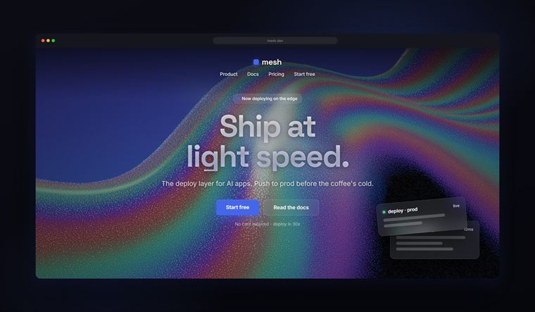
SaaS & landing pages
See the packs →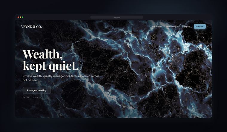
Luxury & premium brands
See the packs →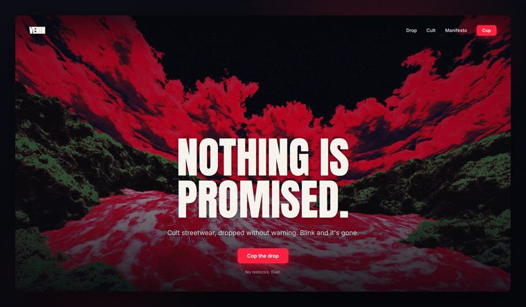
Social media & ads
See the packs → Dark-mode websites
See the packs → Apps & onboarding
See the packs →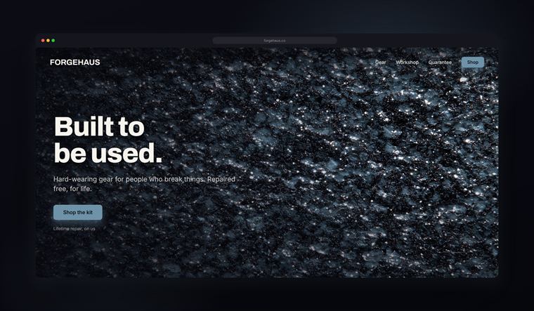
Pitch decks & slides
See the packs →
Backgrounds for perfume & fragrance brands
See the packs →
Backgrounds for jewelry brands
See the packs → Backgrounds for tech & gadget brands
See the packs →
Backgrounds for beauty & cosmetics brands
See the packs →
Backgrounds for fashion & apparel brands
See the packs → Backgrounds for Shopify & ecommerce stores
See the packs →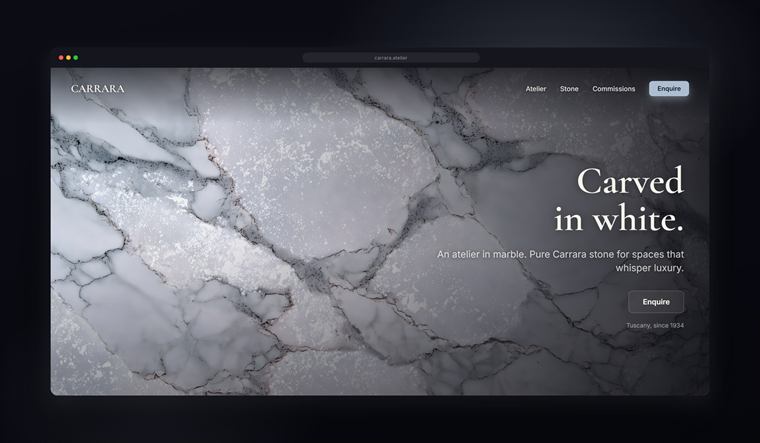
Backgrounds for product photography
See the packs →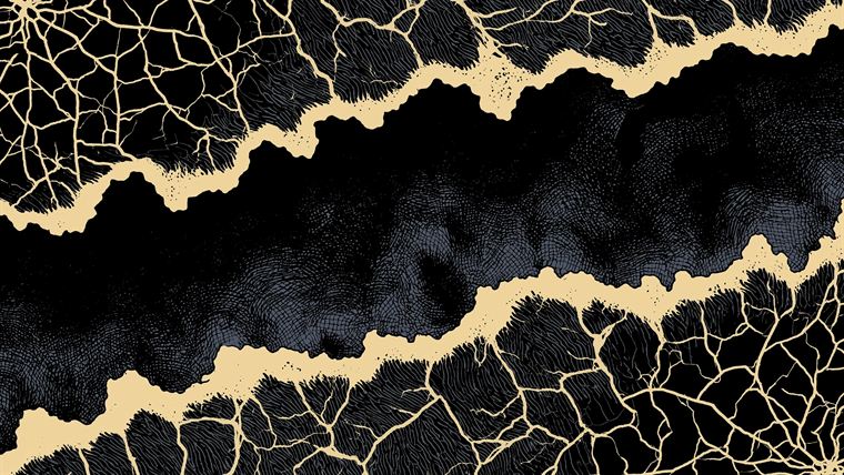
Backgrounds for album & single covers
See the packs →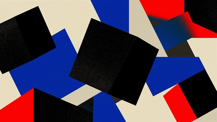
Backgrounds for posters & prints
See the packs →
Minimal & clean backgrounds
See the packs →
Loud & vibrant backgrounds
See the packs →Keep the text readable.
The most common mistake is a beautiful background you cannot read text on. Three fixes, in order:
- Put your text over the calmest part of the image. Most backgrounds have a quiet area and a busy one. Headlines go on the quiet one.
- Add a subtle overlay. A gradient from transparent to roughly 40-60% black behind the text block lifts contrast without hiding the art. In CSS:
background: linear-gradient(rgba(0,0,0,.55), rgba(0,0,0,.15)), url(bg.webp); - Check contrast. Body text wants about a 4.5:1 ratio against whatever sits behind it. The background sets the mood; the text still has to win.
Same background, both times. The only difference is the overlay. That is the whole trick.
Right size, small file.
A gorgeous background that adds two seconds to load costs you more conversions than it gains. Three habits:
- Serve the right size per screen. A 4K desktop hero (3840x2160) is wrong on a phone, it is huge and slow. Hand mobile a vertical 9:16 or a 1280-wide version and let the browser pick with
srcset. - Compress for web. Export the one you use as WebP or AVIF, it cuts the file 60-80% versus JPG at the same quality, and keeps your Core Web Vitals healthy.
- Lazy-load below the fold. Only the hero needs to load up front. Everything lower can wait.
The drop-in for a fast, responsive hero background:
<img src="bg-1280.webp"
     srcset="bg-768.webp 768w, bg-1280.webp 1280w, bg-2400.webp 2400w"
     sizes="100vw" alt="" loading="eager" />
Every Designer Vault pack ships in four ratios, so you always have the right shape for desktop, mobile, square and portrait. Drop in the matching size, compress it for the web, and you are done.
One design, the right crop for each screen. No stretching, no guessing.
Three quiet mistakes.
- Stretching the wrong ratio. A desktop image squashed onto a phone looks cheap instantly. Use the size made for the screen.
- A background that fights the UI. If your buttons and copy are hard to find, the background is too busy. Calmer usually wins.
- The same flat default gradient. The free CSS gradient everyone uses reads as a placeholder. Texture, depth and one cohesive direction are what make a site look intentional.
Browse by style.
Once you know the job and the rules, pick a direction. Each is one cohesive style, in 4K, with every ratio and a palette card.


Try one, on the house. Free.
This exact 4K background, on your desktop and phone, yours to keep. A real taste of the library at full quality. Plus first word when new packs land, no spam, leave whenever.
Get your free background →Good to know.
What size should a website background be?
Use 4K (3840x2160) for a desktop hero, and a smaller vertical image (9:16, around 1080x1920) for mobile. Serve the right one per screen with srcset so phones never download the full 4K file.
How do I keep text readable over a background?
Place text over the calmest area, add a subtle dark overlay (a gradient from transparent to about 40-60% black) behind the text, and aim for a 4.5:1 contrast ratio for body copy.
What file format is best for a web background?
WebP or AVIF for the web, they cut file size 60-80% versus JPG at the same quality. Keep a 4K JPG for print, but serve a compressed WebP on the site.
Why does my background look stretched or blurry?
You are using the wrong ratio for the screen, or a low-resolution image scaled up. Use the matching aspect ratio and start from a high-resolution source.